I have no idea, maybe we should create a google docs or office 365 document, or just use a checklist in the main PR with the disadvantage that only one is able to edit it. Anyways we should mirror the checklist to the PR so that the progress will be visible in the PR overview page.
3 Likes
Because nobody answered so far: here is a small poll about where we should have the checklist
- Google Docs
- Office 365
- PR checklist is sufficient/ok
- Other (see answer)
0 voters
Google docs and office 365 do not require you to have an account if I’m correct, I could share a link via PN (everyone wanting to contribute should then tell me so I can send the link). Having a checklist that everyone involved can edit has the advantage of being able to claim a task if there doesn’t exist an issue for it.
4 Likes
5 people for Google docs, google docs it is 
Now, if you want to contribute, please send me a PM and I will send you the link. If you have a google account it’s even better because if every contributor has one we can make the document publicly available and only invited people can edit it (I would need your email address for that I think?). Otherwise we would not publish the link, that’s ok too.
Oh, and if you’re undecided if you want to contribute, that’s ok too, you can still get access to the document.
If you want I can create an issue to ask lubos for a 2.9 branch?
2 Likes
Thanks for the info,
Yes, please.
Done: https://github.com/armory3d/armory/issues/2074
Also, here is the read-only link to the document: https://docs.google.com/spreadsheets/d/1uQsNnC2zD-NVYmVETWPj_or23QykmJkbRaSZDML5nHY/edit?usp=sharing
4 Likes
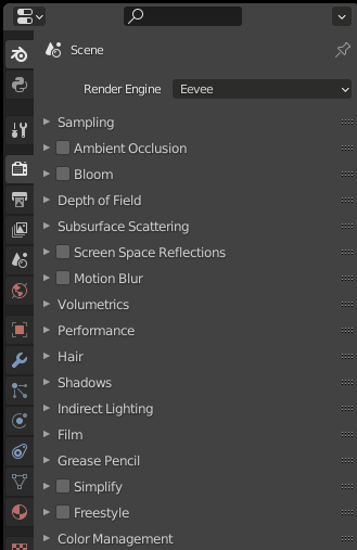
I’m currently updating the Blender UI a little bit because there were some changes in 2.9: margins and alignment have changed and columns can have headings now (some example screenshots). Because designing a UI depends a lot on personal taste, I want to present my prototypes and ask for your opinion before opening a pull request:
Armory Project panel
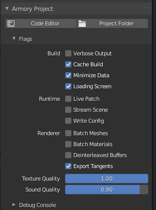
Some options are now grouped together to have a clearer layout, what do you think of the column headings on the left? They’re very vague. Also, what about the order of properties?
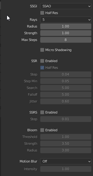
Postprocessing panel (part)
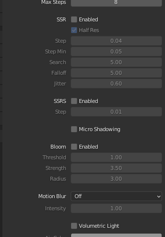
Some options are now grouped together and there are column headings (the checkboxes instead just say Enabled). What do you think of that? It still looks unclear and ugly in my opinion. Especially when a postprocessing effect is active (not grayed-out), the heading is not really different from the property names.
Also, does anyone know if the Micro Shadowing option is in any way related to SSRS?
Compositor panel
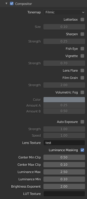
[left: before, right: after]
Some options like letterbox now fit in one line to make the UI more compact. It’s still a bit cluttered but there is a lot less scrolling now.
Material blending panel
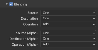
Now the options are grouped together and the alpha group is now marked as such. If the layout is wide enough, the groups are ordered next to each other (flow layout).
I would really appreciate some feedback, thank you
@E1e5en There were quite some changes in the layouts, maybe the bug from here is fixed now?
@Naxela whats the current state of the lightmapper and Blender 2.9? Is there a lot of work that needs to be done? There is at least one small issue that I know of which is described in the todo list in the post above, maybe you can look into that if you get some time?
5 Likes
Hey!
The new UI looks great. Love it!
Some remarks from me:
-
I understand that the Armory Project panel is still a bit vague, but I think there must also be an “Export” Flag. As for my understanding,
Minimize DataandExport Tangentsare more of exporter options, not sure though. -
Post-Procesing feels much nicer and ordered now!
-
The Compositor panel also looks good. However, could the different settings such as “Volumetric Fog” and “Auto Exposure” be spaced apart a bit? Like in the Post Processing panel, This way they are more distinguished.
These are just my opinions. Feel free to correct me if I am wrong somewhere.
Best,
QC
3 Likes
Hi,
I agree, the UI setup is quite good and I like how it is ordered much better with coherent grouping. Especially the compositor panel fits nicely!
As for micro shadowing and SSRS, it’s not directly related, as micro shadowing is a simple shadowing effect that works on the occlusion fresnel, whilst the SSRS is traced, although I’m not sure how it works exactly other that it deals with projection and does something with the view and depth buffer, but effect wise I guess they can be grouped as it’s often (imo) visually similar.
I was wondering, does material blending work for others? Or does the error described here still persist?: https://github.com/armory3d/armory/issues/1615 - I was thinking of looking into it with a fix if it’s not just me.
As for lightmapping, there’s a few fixes that needs to be done due to 2.91 API changes impacting the following areas:
- Scenes/Collections
- UV projection algorithms (Smart Project has been ported from Python to C)
- Python binary paths are changed, I think multiprocessing options was the reason behind this
- Due to changed nodes, integrated denoising needs to be fixed too
- Shifting the same file between 2.83 LTS and 2.91 makes the lightmapper throw errors due to nodes.
- Key bindings are changed; The one listed in the to do list you mentioned
I’ve been getting a lot of enquiries of whether I could make The Lightmapper work for 2.91 too, so once it’s done for the the standalone addon, the fixes should come automaticlly to the Armory lightmapper. Hopefully it won’t be too much work.
3 Likes
Thanks for the detailed feedback!
Yes that’s true (although Export Tangents probably fits in both categories) . What about renaming Build to Export or Exporter and maybe move Loading Screen into Runtime?
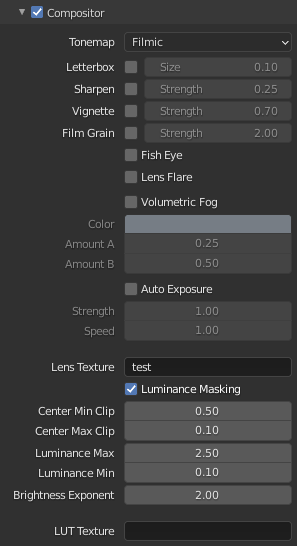
They really should, it makes everything much more clear. I was a bit afraid of it because it kind of suggests that fog and auto exposure settings belong to different “categories” (all the settings above are much denser), but I think having a bit more space really helps to better understand the interface. New layout (I also moved the lens flare and fish eye setting further to the bottom which is also cleaner):
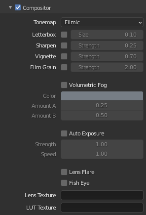
Actually, there should probably also be a separator (blank space) after the tonemap setting at the top.
Then I guess it could be moved a bit up or down, right? It now looks a bit misplaced in between all the other option “blocks”. New layout (still needs some work):
All right, that’s good to know, thanks for your work ![]() I will remove the task from our 2.9 checklist then.
I will remove the task from our 2.9 checklist then.
3 Likes
Looks good! 
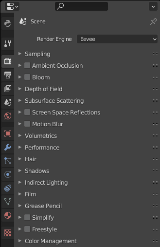
Maybe it’s a bit off-topic, but since it’s in the means of updating/redesigning UI anyway, one thing that always bugged me is that it may be a bit confusing to distinguish the settings for Armory’s renderer and the ones for eevee. I think just the “Armory” in front of the panel is not enough, which would probably lead to confusion for new users. Is there a way to group armory or eeve settings as a whole like in another panel, or is it not possible to do something like that in blender (grouping panels that are “owned” by blender)?
Probably this may conflict with the idea of straight blender-to-armory, but for the time being I think it’s better to keep them distinctly separated until there is a plan to emulate eevee in armory 
3 Likes
The problem is resolved, no error occurs.
4 Likes
I totally agree with you, I also find it a bit confusing and annoying sometimes. I did some research about that yesterday and unfortunately Blender is quite limited in that regard, it is not possible to add a new tab to the properties editor for example even if the Python API for such a functionality would probably look almost the same as the panel API. There are a few alternatives but all of them are not that great in my opinion:
- It is possible to give panel headers an icon (but that’s not “Blenderish” and attracts too much attention IMO)
- Some panels could be moved into side bars of editors, but that would decentralize Armory a bit and makes stuff harder to find… Maybe some trait property things can be duplicated to the sidebar however.
- It is not possible to create custom editors (there were plans for it, I couldn’t find out why they got cancelled). However it is possible to somehow use existing editor types as the base for other editors, like the Scatter addon does it (source) with the preference editor. I have no clue however how it’s done, it’s a paid addon. Also, I don’t know if that is only possible with the preferences editor. In general, the scatter addon UI is quite impressive.
- It is possible to embed imgui in Blender which can be overlayed either in an empty node editor for example or over the 3d view, but it’s ugly and just too much work.
- Also adding Armory as a render engine could work (probably less panels would show up), but if I remember correctly Lubos decided against that while he was still working on Armory. I think it has a lot of disadvantages (loosing Eevee preview and many other settings)
Edit: I have an idea…
3 Likes
Ok, so I found a hack with which a “cheated” custom Armory properties panel is possible, but it has some flaws:
It’s currently using a Python icon for the Armory tab, but it can be replaced later
This works because there are a bunch of happy coincidences in the API:
- You can append/prepend to the tab bar drawing function
- You can create another
EnumPropertythat holds all custom tabs, unfortunately you can’t update the internally used property that holds all default tabs (=> no real custom properties panel) - Set the options of the new
EnumPropertytoENUM_FLAGso that its only value (the Armory tab) can be deselected (this enables multiple selections but we only have one item in it) - If the new tab is selected, set the properties panel “context” (active tab) to
render. - Now, override/wrap the
poll()function of all panels in the render context to additionally check if the Armory tab is active
So the Armory tab is actually the render tab, but when drawing the UI there is a selection based on whether that tab is active or not.
As you can see in the render properties, you can even draw on top of the properties panel without having a sub-panel (see the Render Engine dropdown for example), which has also a poll() method and to which you can also prepend/append drawing functions. This makes it possible to have even more freedom with the UI, you are not bound to panels. For example we could permanently stick the Play/Clean buttons to the top with that.
Flaws:
- You can check for property updates on the new tab(s), but not on the existing ones as far as I know. This means that you have to deselect the Armory tab with
Shift + Clickwhich is bad (otherwise you could deselect it when another tab is activated). There might be ways around that with the msgbus module but that will not work if you switch back to the render panel as it is already active (-> no update triggered). - The new search menu doesn’t work yet with the Armory tab, but I think it can be made possible
- When – for example – pinning the current material in the top left corner of the material properties area, the Armory tab doesn’t hide. I don’t know yet if this is possible to implement.
Two workarounds
-
Replace the new Armory tab with a toggle button (
BoolPropertyunder the hood) that just decides for ALL tabs whether only the Armory panels should be visible. Actually, I kind of like this solution even if it doesn’t give us as much freedom with the UI if we decide to keep the Armory UI visible even when this button is not activated (that’s something to discuss then). Problem: the toggle button would be a few pixels too far to the left compared to the tabs, I’ve spent half an hour searching for a way around that but I didn’t succeed. You could replace this with an icon and a checkbox below that, but it would probably look ugly. -
Introduce a 2-layered tab bar. There would be a Armory button at the bottom and if you click on it, the default tabs collapse into a Blender button and the Armory tab opens. To open a default tab, you’d first have to click on the Blender button to close the Armory tab and to go back to the default tab view. This allows us to even add more Armory tabs without having a too big tab bar and it solves the clicking problems mentioned above (like node categories but for tabs). This can confuse users but it’s actually not that counter intuitive. However, the disadvantage is that we need to fully override and copy the tab drawing function, which makes it more dependent of Blender updates. But it would work.
Obviously there is still the option to keep it as it is, I have to do more tests first.
I hope this was understandable to some extent, I’m pretty tired and I want to go to bed but I am too exited to not let you know about my findings today ![]()
4 Likes
That’s awesome! nice findings ![]()
Would it break if another addon decided to do the same for example?
For example we could permanently stick the Play/Clean buttons to the top with that.
This would be pretty cool!
I’ve spent half an hour searching for a way around that but I didn’t succeed.
Have you tried asking around in Blender Chat or Blender Chat?
2 Likes
If we only use appended/prepended drawing then no, otherwise it depends. We can wrap the draw and poll functions so that we call the original functions in the overridden ones. If someone changes them, we still use the changed functions if the other addon is registered first, so Armory doesn’t break other addons. If it’s the other way around, it’s for the other addon to ensure that nothing is broken (also via wrapping so that there is a call stack of draw or poll functions). But I don’t know of any other addon that does this, I think its a solution that nobody used before, so we should be pretty safe anyways.
Thanks for the links, I didn’t know those channels. The pixel offset mentioned above is probably something that needs to be fixed in the Blender layout code, I tried about every combination of rows/cols/splits/boxes you can imagine^^ The tab bar is just not made for any other layouts/widgets. I wish there would be a variable that lets you offset an element by a few pixels, like Zui can do it.
If you (@ everyone) understood the workarounds I paraphrased above, which one do you prefer? New prototype for the second idea (in theory we can now add multiple Armory tabs without having a crammed interface):
Btw, the search menu is fully functional with this, I have no clue why but it’s great ![]()
We need some proper Armory icon, I took one from an Armorpaint commit but it doesn’t look that good in the UI (maybe it’s just slightly too large compared to the other icons?):
Found another flaw: it’s not possible to add custom properties to panels, only to screens (layouts) or the entire window manager. So when you switch to the Armory tab, every opened properties editor will switch to it.
3 Likes
I could be wrong, but I think this way will give some work to update for future Blender versions (we can’t expect Blender Foundation to leave this “support”. As you said, even you don’t know why this is working). I don’t know about what is better as i never touched Blender API, but my idea would be to create a second Editor type (or even just copy/paste the properties editor type and remove the Blender stuff from it). This way even the objects tab will be more clean (it have lot of settings and the word “Armory” before each title bar looks like a workaround for me). For tabs that intersects between the Blender properties and Armory properties, maybe is possible to create some kind of “link”? Like for the physics tab. This is just what i think, maybe this thing is a pain to do and i personally don’t care about the UI organization and i will be happy with any layout, but the truth is without an intuitive Ui, newer users may be scared and this is not good for all of us. And thanks for your initiative guys, is really inspiring to see your commitment as always
2 Likes
The “I don’t know why it’s working” was about the new panel search, and I falsely thought that it somehow overrides the poll() method but it doesn’t. So, everything is clear now for me ![]()
Regarding the “Blender-dependency”: In my opinion it’s not a big problem in this case as the tab bar layout is probably changed once every 10 years or so, even then it will probably continue to work as we would wrap the original drawing function in our drawing function (Python makes this pretty easy). Basically we just append something in front of the original code. There are a lot of other things that break more often.
But the flaw that I found yesterday is a huge problem unless we decide that it doesn’t matter if the Blender/Armory switch has the same value in all windows (so you see the same panel)… In theory you could dynamically create a tab bar for every properties editor with it’s own enum property but that would be the ugliest workaround the world has ever seen^^ So unless we find a better solution I guess we need to keep the current way. Does anybody have an idea maybe?
Speaking of a better solution:
That would certainly be the cleanest and best way, but unfortunately it is not possible with the Python API (you would have to change the Blender source code and provide custom builds), that’s why I was looking for a way to create a new properties tab. Blender’s Python API is very restricted unfortunately even if it’s huge. On the other hand, that is what makes you creative because you always need to find workarounds. The reason why Armory has a custom node editor is just because of the fortunate circumstance that Blender creates an editor for every node tree type.
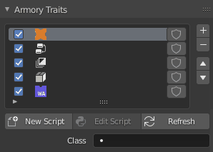
Slightly redesigned trait panel, what do you think?
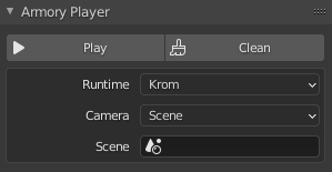
Improved player panel:
4 Likes
Is the workaround really that ugly? ![]() I think it may be worth it if it’s not a hell to maintain and/or can be self-contained and not uglily spread all around the codebase… In the mean-time probably an issue or message in the blender chat to reach the UI mantainers to see what they think about these limitations would probably be a good idea I think…
I think it may be worth it if it’s not a hell to maintain and/or can be self-contained and not uglily spread all around the codebase… In the mean-time probably an issue or message in the blender chat to reach the UI mantainers to see what they think about these limitations would probably be a good idea I think…
Slightly redesigned trait panel, what do you think?
Pretty good! ![]()
2 Likes
It’s at least … unusual and a matter of opinion. I don’t even know if it would work at all but I can do some tests in the next days. A feature request is also a good idea, maybe there even exists one already (I also plan on contacting the author of the Scattering addon to maybe get some insight about how the preference editor thing works, maybe it uses a similar solution).
Sorry, there is again a big wall of text coming (beware of the two meanings of property as in “Properties Editor” and “custom property”):
Because I left out many details: UI drawing methods like layout.prop() require a property that is “synchronized” with the drawing. Blender’s data system only allows properties for ID blocks and some hand-picked other types like the addon’s preferences. So the value of the property belongs to the instance that actually holds the property, it can be an object for example or the entire window manager (like a global instance, but it isn’t saved. That’s why we have the “Arm” world). When drawing the property, you always need to pass that instance as well (like instance.value as in any programming language).
Because areas/regions can’t hold properties, we either need one instance of some type for any open properties editor or we need to have as many enum properties (all the tabs are stored in an enum) in the window manager instance as we have editors. I would go for the latter because we then don’t have to deal with data blocks the user can edit by accident. It is possible to hide text blocks (I used it a few years ago), so that could work as well. Maybe we can even replace the “Arm” world with that and add a small API for it for easier access.
Then, we need a way to identify each editor and give it a unique id (via pointer or hash()) and map each properties editor to a enum property that holds the current tab for that editor. The mapping should be calculated fast because it must be calculated in each drawing of the editor because we need to tell the draw functions which enum we wan’t to draw. The same goes for the poll() functions, so that the correct panels show up depending on the current editor context.
The most difficult part I guess is to react to new/closed editors and to create the enum property accordingly. I don’t know if this is possible with the msgbus module but I don’t think so, there is no logging in the info editor when opening a new editor. So again, a workaround is required. You could add some lines to the poll function of each property editor’s draw function that checks if the editor is “registered”/mapped yet to fake a listener and if not, create a property for it. But what to do with closing properties editors? It will create more properties and requires more and more memory until you close Blender if we don’t cleanup after a properties editor is closed. So we need yet another workaround here. But I didn’t research yet if somebody already found a solution for this, maybe we’re lucky and it is possible ![]()
So yeah, this is a bunch of code that has to be well-documented and I have no idea if it works and if it is fast. But the idea of having an own editor panel and being the first addon which does this is quite tempting of course ![]()
Edit: You could probably listen to changes in the length of the areas or regions attribute of the current screen (I always confuse area with region, sorry^^). But I don’t think it works as changing the length of a collection does not really update the attribute value (the collection object remains the same). Let’s test that.
2 Likes
Ok, I get it, it’s a workaround on top of a workaround on top of an experimental feature on top of a workaround on top of…
I read your “big wall of text”  three times but still there is a lot I don’t understand about blender api and the likes, but from what I gather from your text is that it sounds very tricky to get it right. That’s a shame.
Probably opening a feature request to have a proper way to add a new tab seems like a better idea.
2 Likes