I’m currently updating the Blender UI a little bit because there were some changes in 2.9: margins and alignment have changed and columns can have headings now (some example screenshots). Because designing a UI depends a lot on personal taste, I want to present my prototypes and ask for your opinion before opening a pull request:
Armory Project panel
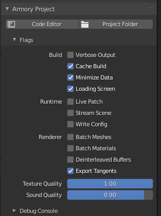
Some options are now grouped together to have a clearer layout, what do you think of the column headings on the left? They’re very vague. Also, what about the order of properties?
Postprocessing panel (part)
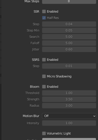
Some options are now grouped together and there are column headings (the checkboxes instead just say Enabled). What do you think of that? It still looks unclear and ugly in my opinion. Especially when a postprocessing effect is active (not grayed-out), the heading is not really different from the property names.
Also, does anyone know if the Micro Shadowing option is in any way related to SSRS?
Compositor panel
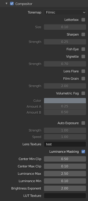
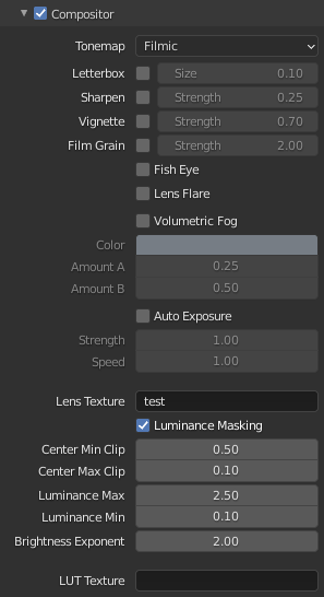
[left: before, right: after]
Some options like letterbox now fit in one line to make the UI more compact. It’s still a bit cluttered but there is a lot less scrolling now.
Material blending panel
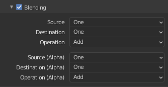
Now the options are grouped together and the alpha group is now marked as such. If the layout is wide enough, the groups are ordered next to each other (flow layout).
I would really appreciate some feedback, thank you 
@E1e5en There were quite some changes in the layouts, maybe the bug from here is fixed now?
@Naxela whats the current state of the lightmapper and Blender 2.9? Is there a lot of work that needs to be done? There is at least one small issue that I know of which is described in the todo list in the post above, maybe you can look into that if you get some time?