At first I liked the idea of the anvil until I actually tried turning it into a logo. It turns out that by itself, it’s actually a pretty obscure shape which isn’t very recognizable until you add other elements to it like hammers, or other details which make it literally less iconic.
Then I was thinking about the suggestion someone made above, of a piece of armour with an A, which I liked. The most recognizable piece of armour is a helmet, so I tried merging a helmet with a subtle “A”:
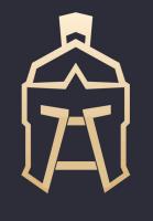
By the way, currently this is a piece of clip art, modified to include the “A” so don’t use it directly. That said, I can easily draw up something of similar quality, with whatever colors we want, if the overall design is agreed upon. I could also make the lines forming the “A” thicker to emphasize more, if wanted.
I’d also recommend that anyone posting designs here, post them at a size similar to how they’ll be seen. Size changes perception, especially with icon size images. Poster sizes may look nice big, but the real test is if they’re still readable at postage stamp sizes.