As I see the logo Armory has right now, I can’t help thinking it’s a temporary one. Am I right about this?
Yes, left it as it is for now to focus on other things, but should be replaced eventually… 
1 Like
Okay. In that case, I can help with that, since I have a pretty nice idea for the logo (and maybe even a font for the website and everything). I wouldn’t want to show a rough and almost unreadable sketch, so it’ll take me some time to make a clean version of it.
In fact, I even have an idea for a logo for the enemies in the demo projects.
1 Like
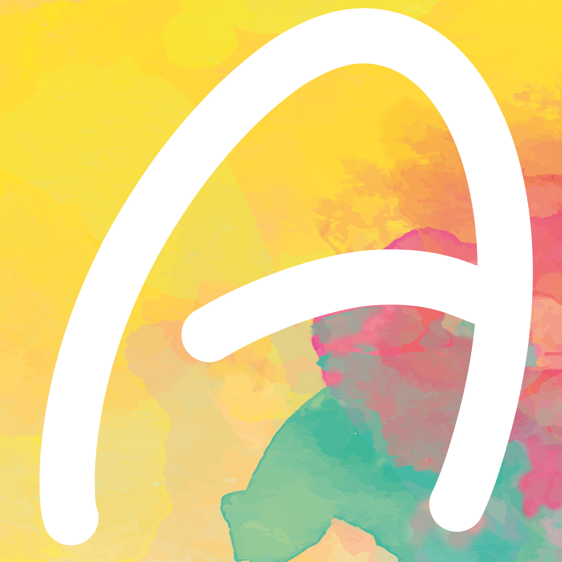
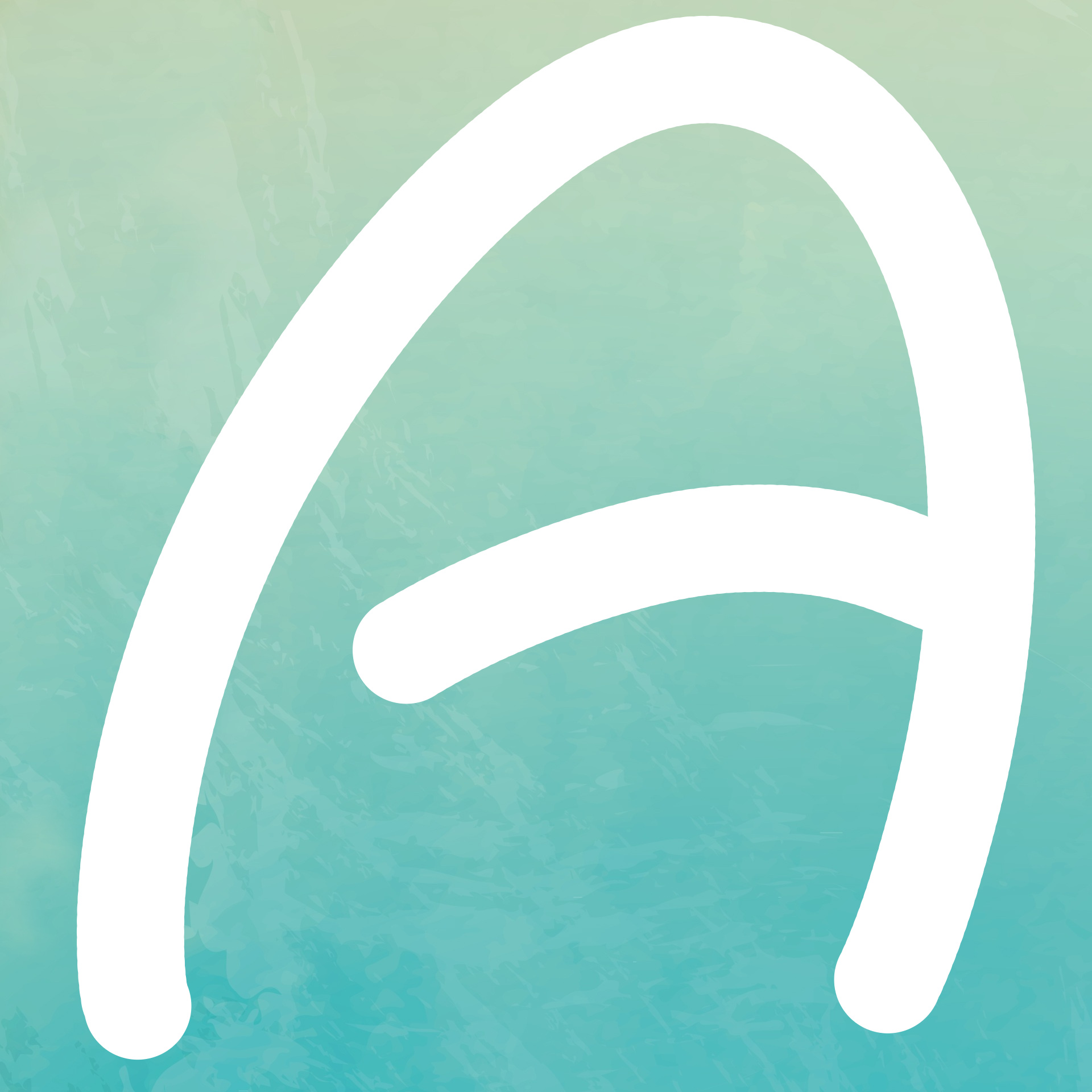
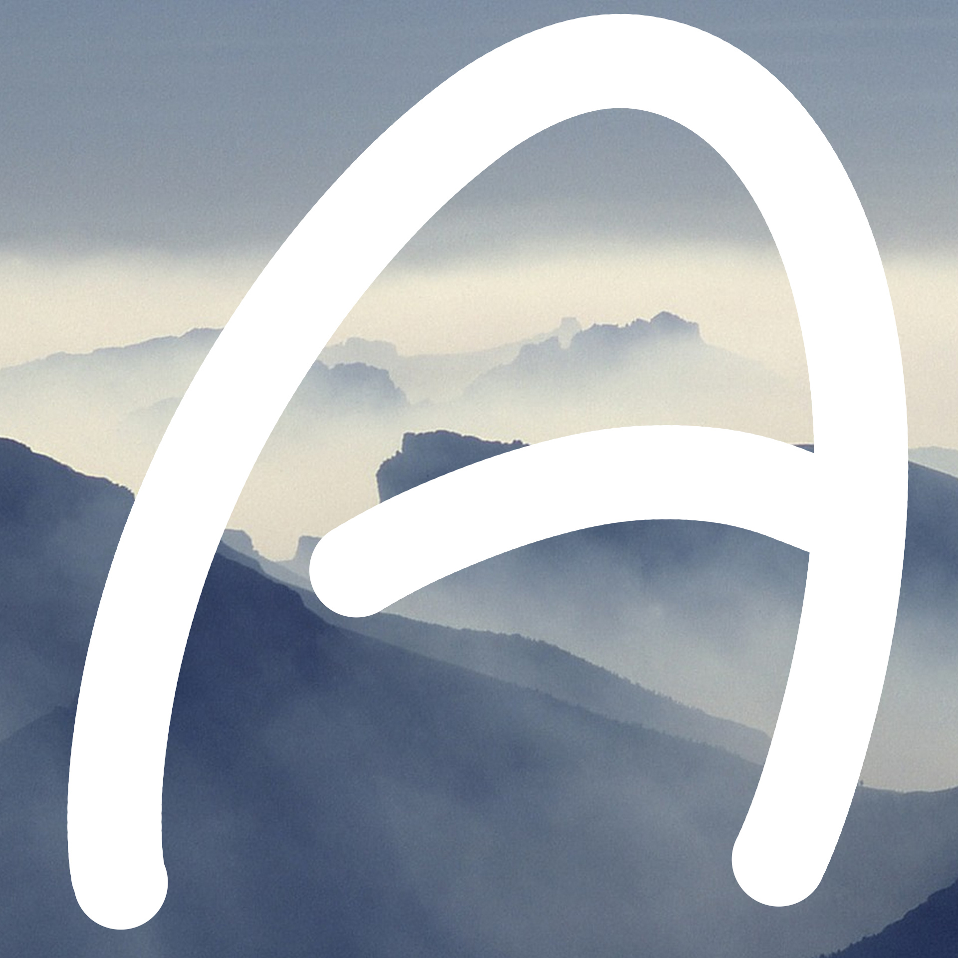
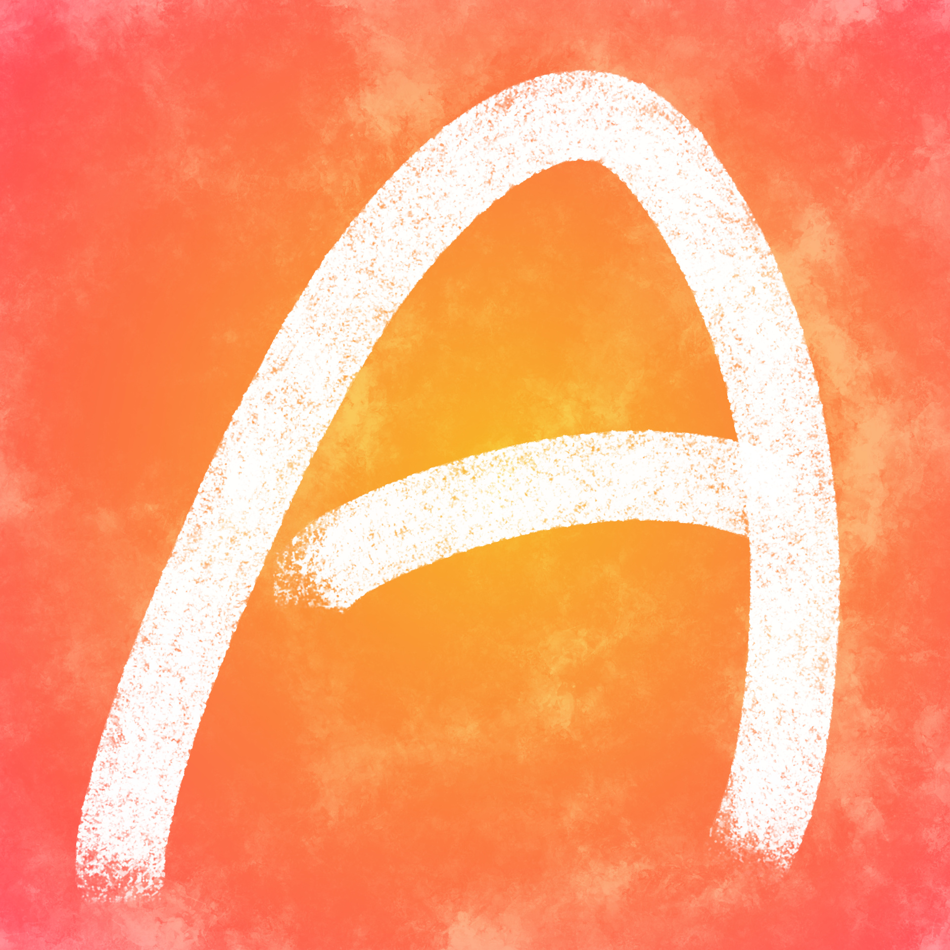
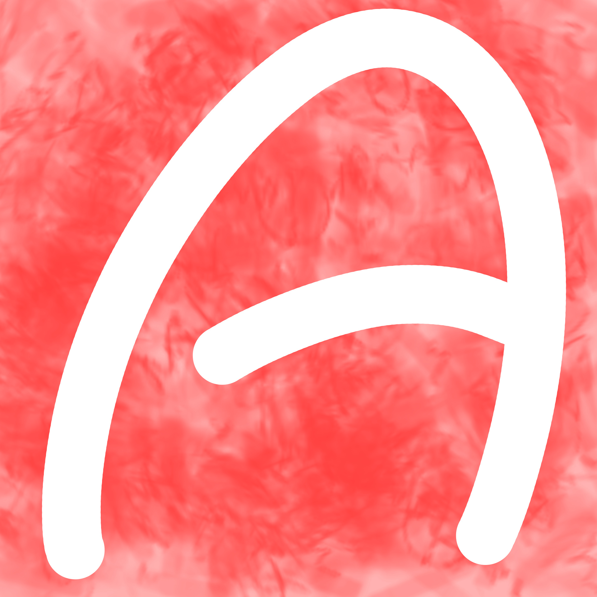
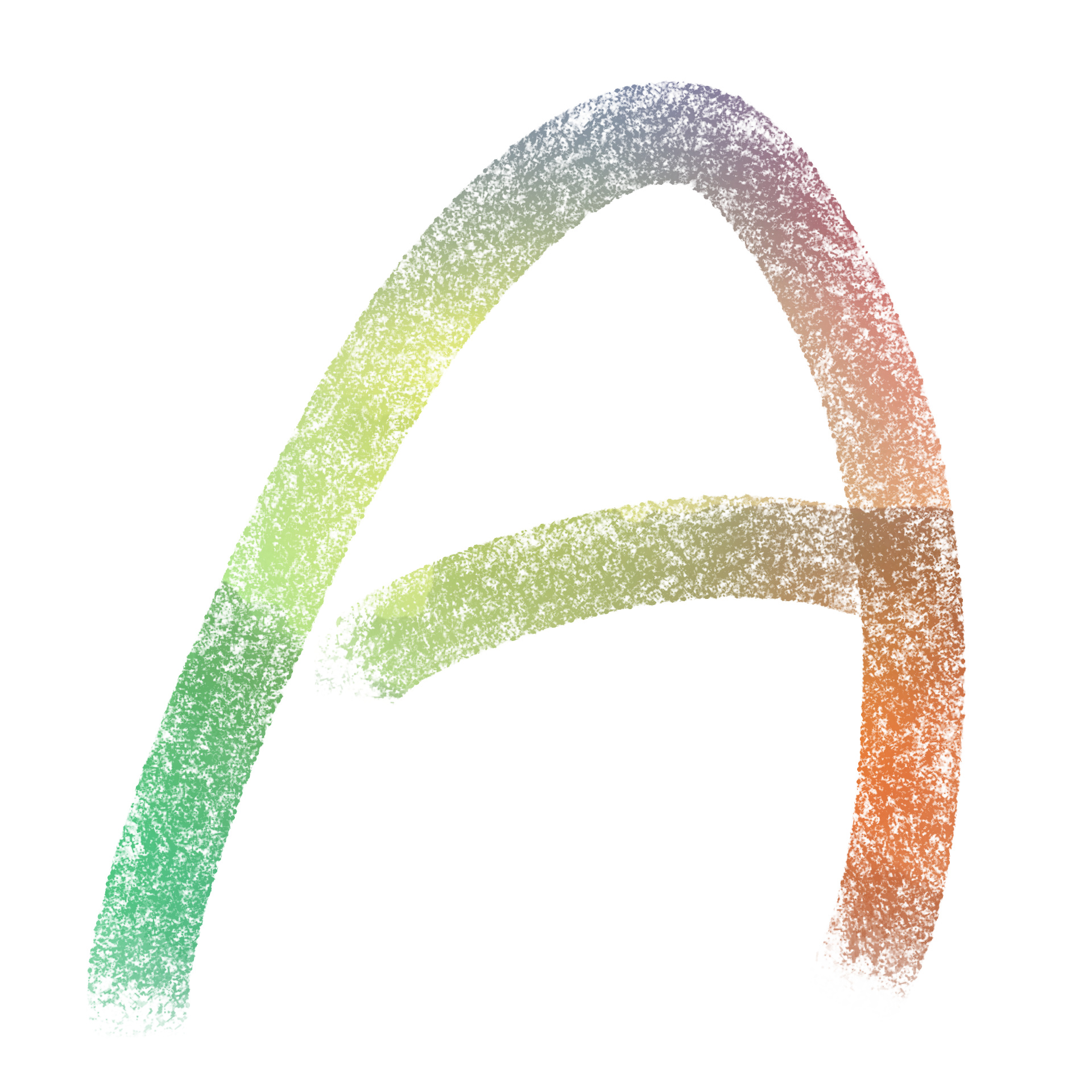
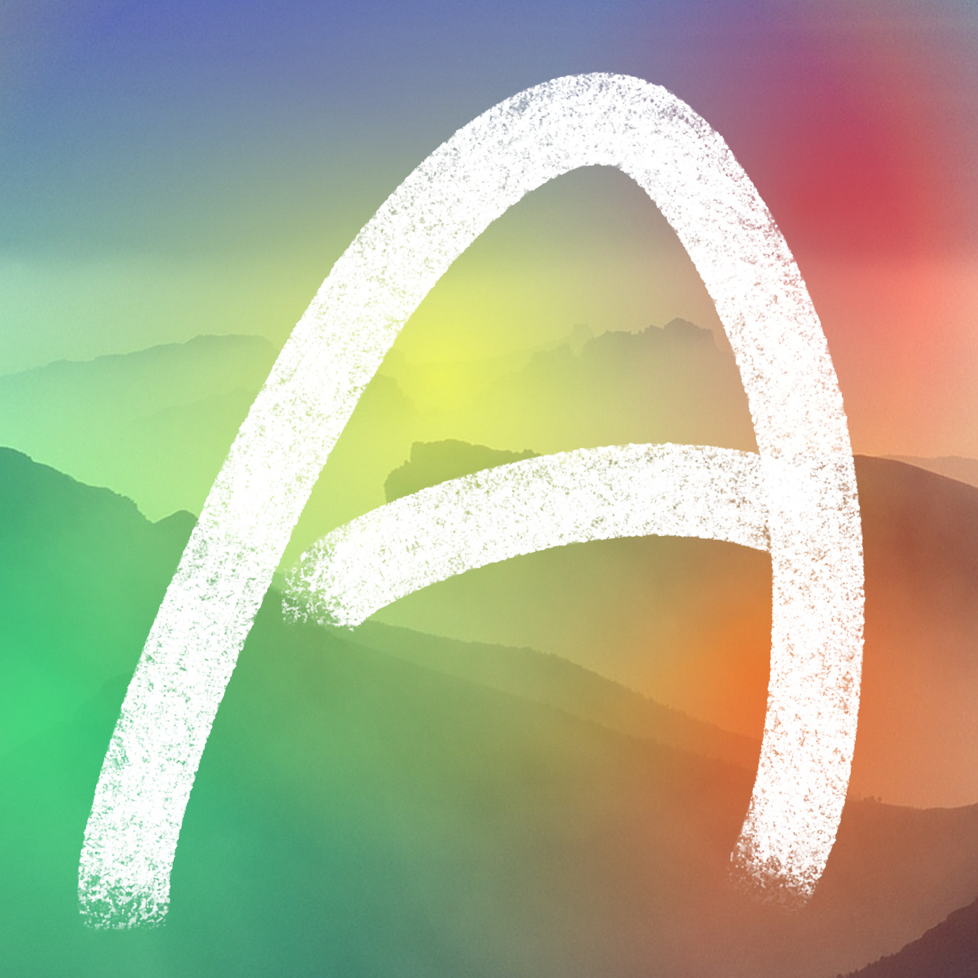
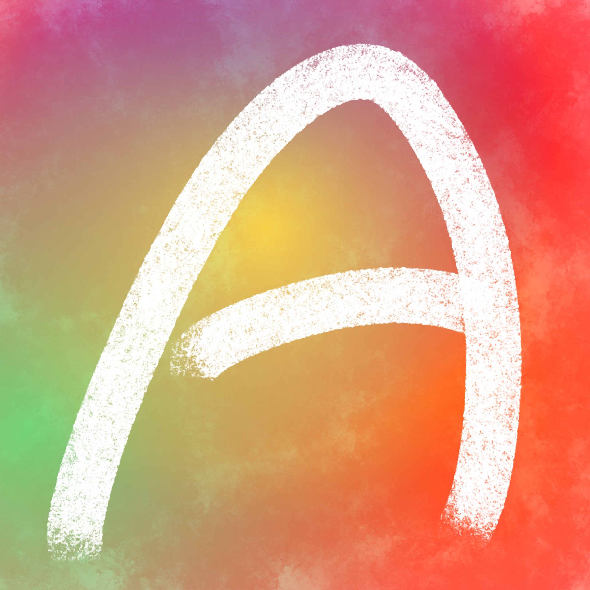
Hey there again! Here’s the idea I was talking about (just the shape, we can decide the colors and decoration later):
And here is a quick sketch of the font for the logo as well:
1 Like

Yeah, yours is pretty neat, too. Maybe the mascot discuss shouldn’t be mixed up with the logo one, and as I saw sans-iccal… I thought there would be just a quick mention about that. Anyway, you can post your idea here as well, so that we have all the ideas for the final logo in a single thread without other topics. Even though, I’ll keep working about my idea, as I think that my font could make it to the engine’s identity in the end.
1 Like
May the force be with you
1 Like
(Disclaimer: Sorry for huge post size.)
TBH, I really liked the feel of the Armory logo, Even tho it looks like a lot of other logos out there.
In an attempt to try to make logos for ArmorPaint (So it’s not the same exact logo as Armory) I managed to make alot of decent looking logos, for both apps.
Some textures used are from Pixabay.
These may still be called "Placeholder"s, but im ok with them.
Logos (Download by right clicking and pressing “Save image”):


Source (In the Kra format):
https://drive.google.com/open?id=1zDuS_9XimYdaAb5lhPCrR8n1E_0QGgIa
Enjoy!
-J
I want to see a logo that doesn’t look anything like “Adobe.”
it’s just an ‘A’,
it can look like anything.
I just tried to make it not look like some of the logos I currently know while keeping the original form of the logo.
My suggestion is to take a medieval plate vest and make it look like an A
1 Like
Love the simple ‘A’ in current logo and I don’t see any problem with it. For armorpaint maybe keep the ‘A’ and change the background color to the 6th image(color of ‘A’ in 6th image)
1 Like
Personally, I think there are too many As in the software field. This is especially true with Adobe and Autodesk. Getting away from the “A” themed logo would help set it apart, otherwise it looks like mimicry of Adobe/Autodesk.
If I were to offer a friendly suggestion, I’d say look at the old easily marketable TSR logos/Warhammer logo for inspiration. Instead of “WAR”, it could just be “ARM” or the complete “ARMORY”.
Examples: https://imgur.com/a/sNNTwjG (links to a set of images)
Alternatively, some circular fire logo with the silhouette of an Anvil in the center could be easier to reproduce using vector art.
Food for thought.
I wholeheartedly agree about there being too many As. Let’s put a K in there.
1 Like
At first I liked the idea of the anvil until I actually tried turning it into a logo. It turns out that by itself, it’s actually a pretty obscure shape which isn’t very recognizable until you add other elements to it like hammers, or other details which make it literally less iconic.
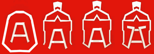
Then I was thinking about the suggestion someone made above, of a piece of armour with an A, which I liked. The most recognizable piece of armour is a helmet, so I tried merging a helmet with a subtle “A”:

By the way, currently this is a piece of clip art, modified to include the “A” so don’t use it directly. That said, I can easily draw up something of similar quality, with whatever colors we want, if the overall design is agreed upon. I could also make the lines forming the “A” thicker to emphasize more, if wanted.
I’d also recommend that anyone posting designs here, post them at a size similar to how they’ll be seen. Size changes perception, especially with icon size images. Poster sizes may look nice big, but the real test is if they’re still readable at postage stamp sizes.
4 Likes
+1
It’s a really unique idea, and it’s well made.
That helmet one is actually pretty good. Looks professional.
Some tests
1 Like
I like how the third variant above emphasizes the A a bit more. I wanted to see what it would look like with the eye holes:

My brother says that you just need to change the color of the A section of the helmet to make it stand out…And that it is really cool. 